


Our biggest project yet,
The Rebrand of PCCNCF.
Logo Designed by Cai Husband | Animation by Eos Chu
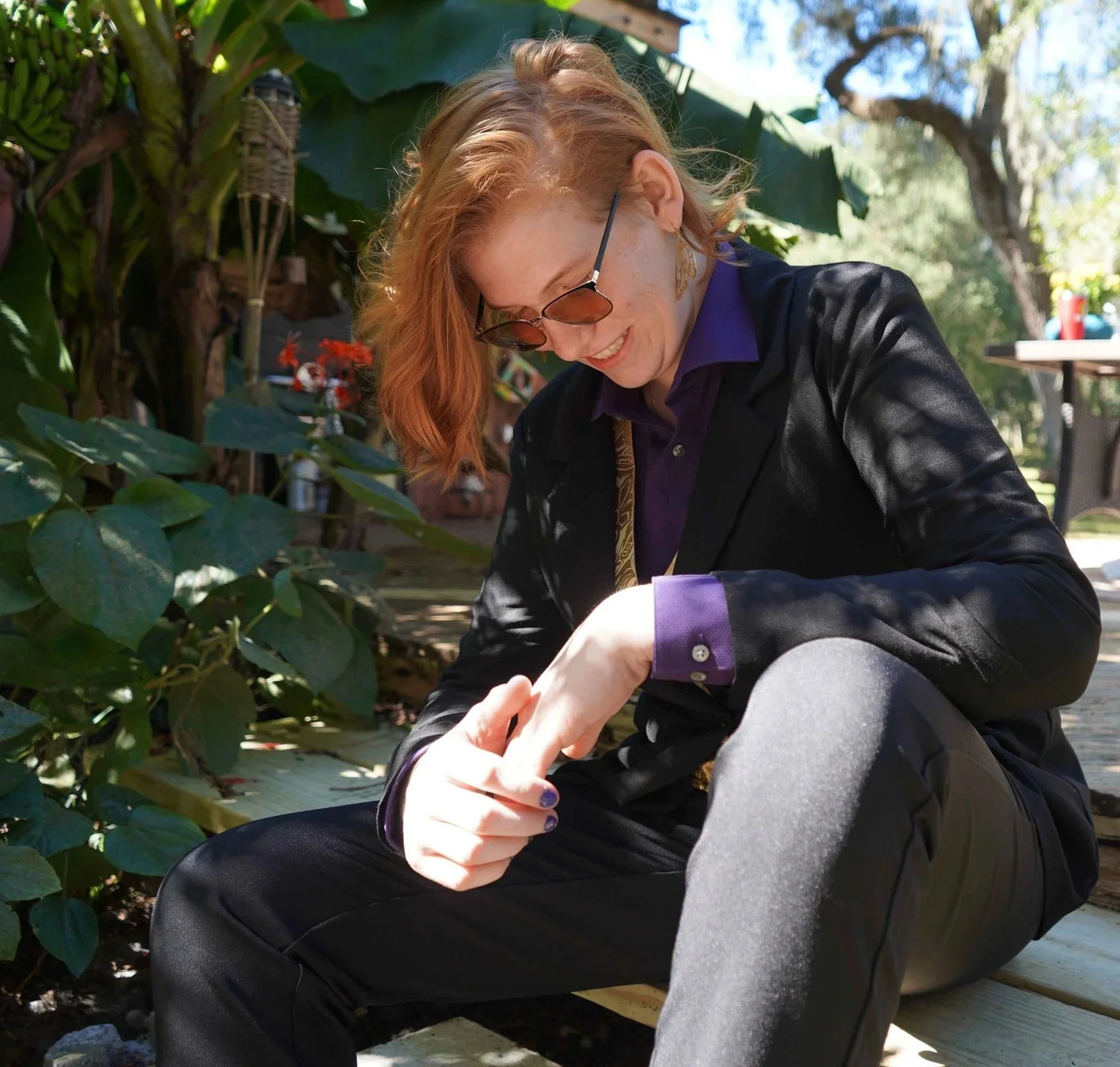
Cai Husband
the designer behind the rebrand
Cai is a designer whose mission is to use design as a bridge to equity. Using creativity as activism, they amplify underrepresented voices and challenges the design world to create to change the world.

Having multiple logos that you can recognize that is us, allows us more versatility in branding.

Why Rings?
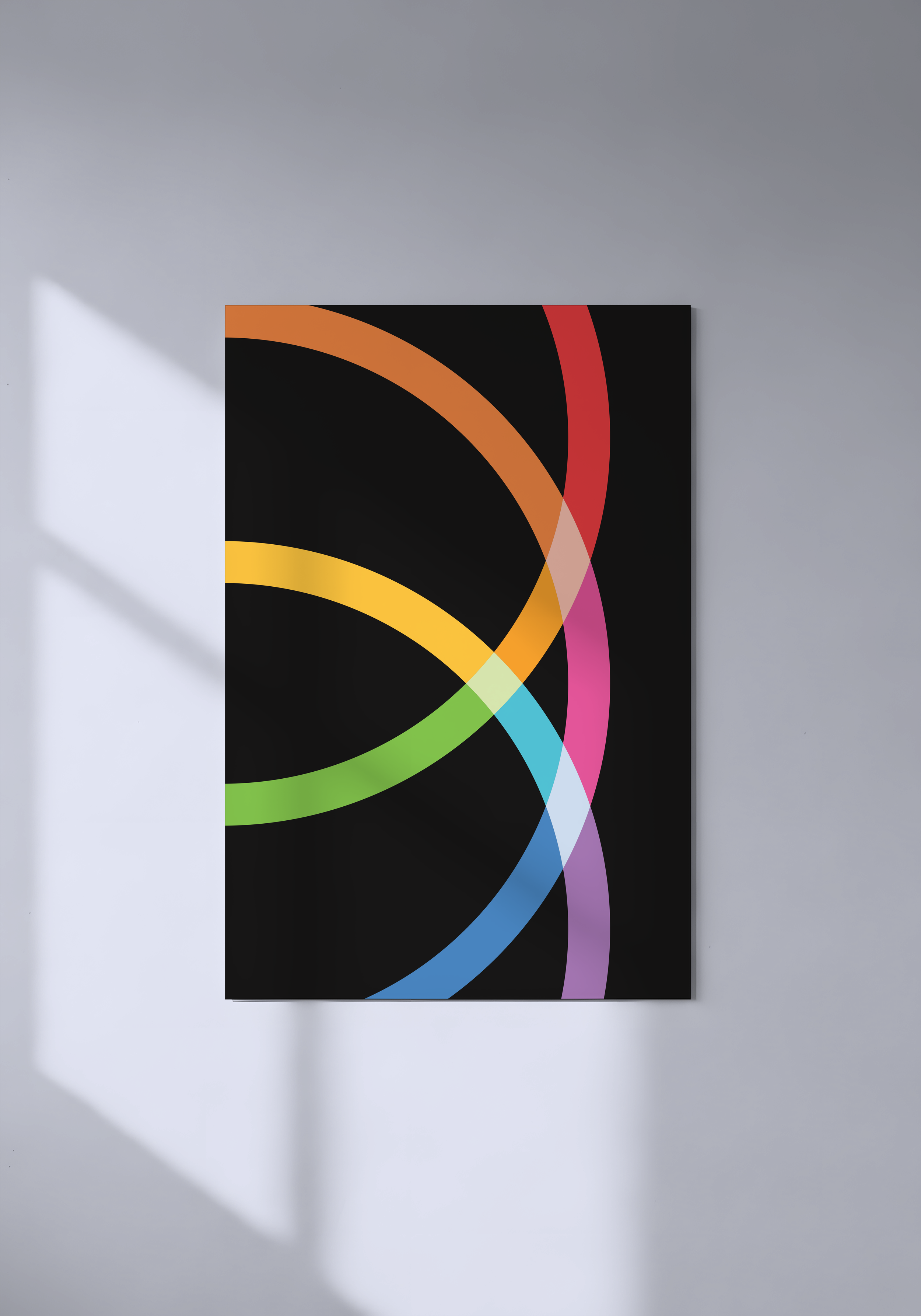
We chose rings for our logo because they represent connection, community, and inclusivity. Each ring overlaps with the others, symbolizing how our lives intersect and how our identities are intertwined.
Rings are something used in other very elegant widely known organizations and brands, but ours that are spreading upwards are like none other. During the logo process Cai tried their best to avoid common lgbtq and pride cliches because the Pride Center is unique and needed a logo that represented that.